ALIGNMENT
Nothing should be placed on the page arbitrarily. Every element should have some visual connection with another element on the page.
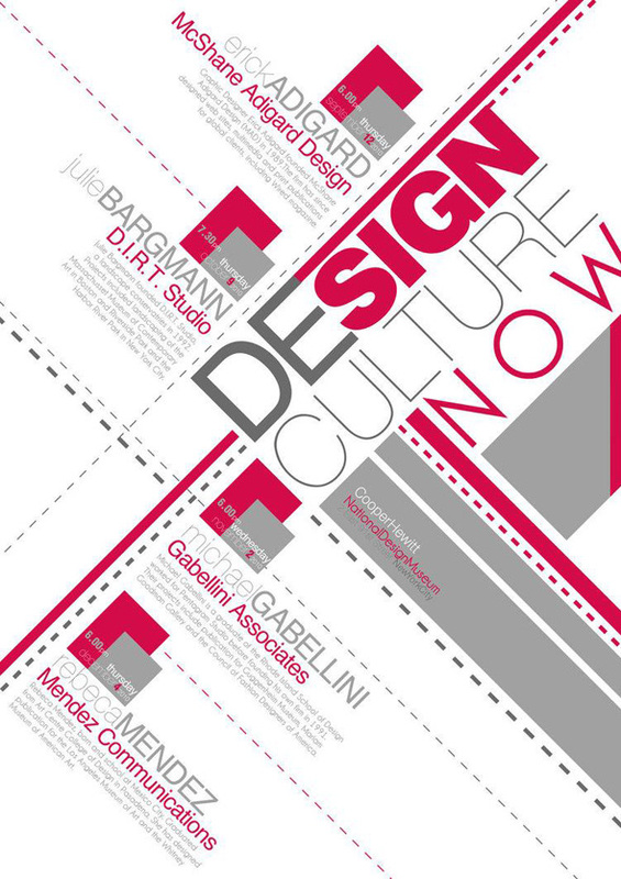
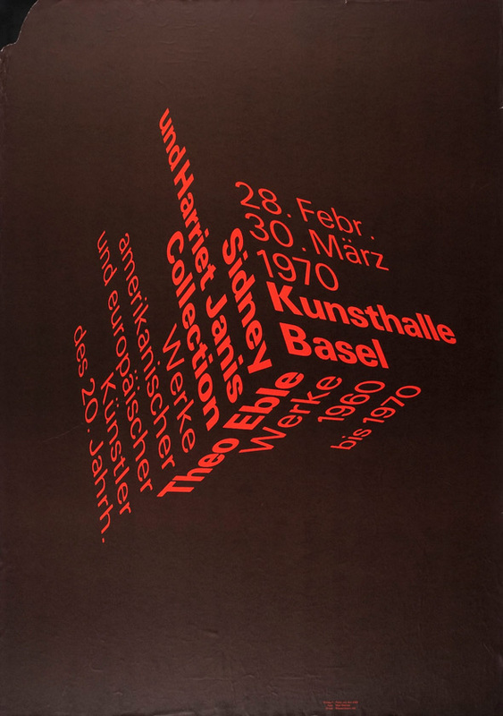
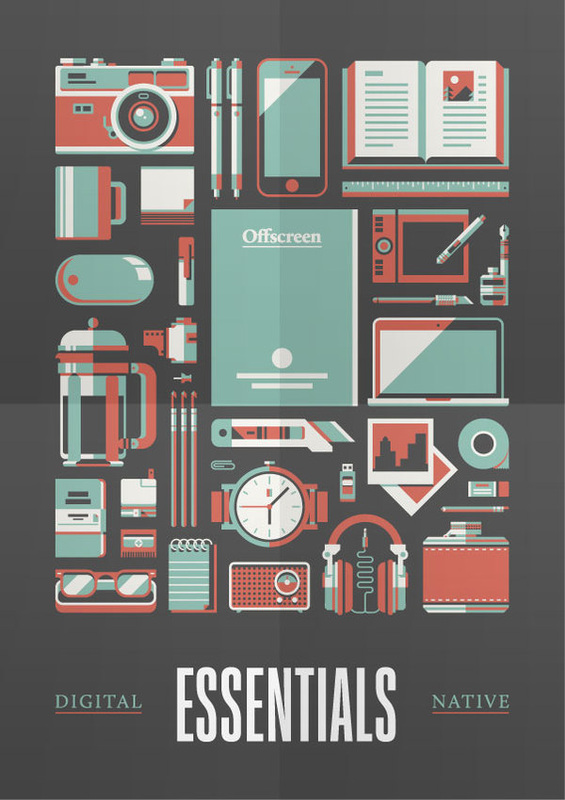
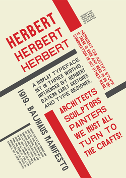
Unity is an important concept in design. To make all the elements on the page appear to be unified, connected, and interrelated, there needs to be some visual tie between the separate elements. Even if the separate elements are not physically close on the page, they can appear connected, related, unified with the other information Simply by their placement. Take a look
at designs you like. No matter how wild and chaotic a well-designed piece may initially appear, you can always find the alignments within.
The basic purpose
The basic purpose of alignment is to unify and organize the page. The result is similar to what happens when you (or your dog) pick up all the dog toys that were strewn around the living room floor and put them all
into one toy box.
It is often a strong alignment (combined, of course, with the appropriate typeface) that creates a sophisticated look, a formal look, a fun look, or a serious look.
How to get it
Be conscious of where you place elements. Always find something else on the page to align with, even if the two objects are physically far away from each other.
What to avoid
Avoid using more than one text alignment on the page (that is, don't center some text and right-align other text).
And please try very hard to break away from a centered alignment unless you are consciously trying to create a more formal, sedate presentation. Choose a centered alignment consciously, not by default.
Source: The Non-Designer's Design Book by Robin Williams