

BAUHAUSING THE FAMILIAR
A GRAPHIC DESIGN 11/12 PROJECT
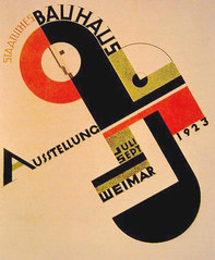
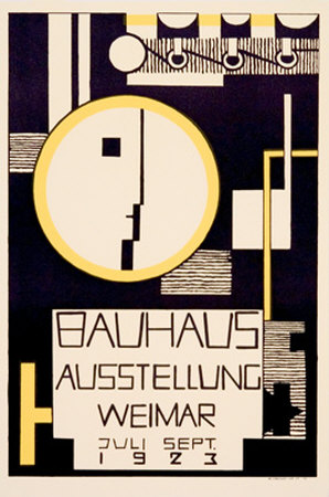
When examining the Bauhaus style You will see a balanced layout, vibrant colors, harmony, geometric shapes strong bars, bold and universal type. Using upper case or lower case fonts, but not a combination of the two, the typeset is clear and concise and can be laid out in various ways. In addition to being horizontal and vertical orientation, Bauhaus is well-known for placing text at angles and also wrapping text around objects.
In this project you will be exploring the Bauhaus style and applying it to familiar signs and informational guides. Your challenge is to think about how different a sign or piece of visual information would look if it was created in the Bauhaus style.
Illustrator Tools to focus on in the project:
Type on a Path Tool
Using the Appearance panel to add more than one stroke
The offset path function to place strokes off of an object
Using the blending and opacity modes we explored in the Vintage Poster Demo
Using different Colour swatches you download from colourlovers.com
What to consider to make the design successful:
What are the unique/defining characteristics of the sign you are “bauhausing?”
What colour palette should you work in?
How much or little text will you need to use?
What Bauhaus designs will you look to for inspiration?
Will your design add extra information to your sign or simplify it further?
Size:
16 x20 Inches
Resources & Inspiration:
VIDEO: Bauhaus: Design in a Nutshell
History of Bauhaus Design
colourlovers.com-great place for finding those vintage swatches!Paper Textures
More Paper Textures
Bauhaus Poster Examples