Missed Communication
In this design challenge we are going to be much more concerned with hand and digitally drawn illustrations with much less emphasis on typography. You will be looking at two artists: Jorge Lewarta & Andrew Bannecker. Both of this artists use simplistic yet expressive illustrations to convey ideas and meanings through their designs. You will be wrestling with the concept of self identity and human identity in this project.
Criteria:
Have a look at this page for ideas of stereotypical art student "types"
Example of how this brainstorm/research might look:
Identity: Art Student
Generalizations/stereotypes: the dreamer, not as good at academics, not into sports, dresses "arty", doesn't conform or is not into "mainstream" things etc.
Actual reality of the person: Is incredibly linear in thinking, star basketball player, dresses very "normally." etc.
How could I create a design based on this?
Criteria:
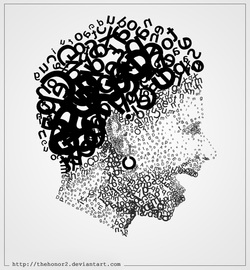
- Your design must feature a human as the central element in your design
- You can have some other elements as well but it should remain a fairly uncluttered design.
- The content should focus on the nature of HUMAN IDENTITY in our society in 2014. Specifically how we identify ourselves and how we attempt to identify others through the way they dress, behave, style their hair and generally present themselves.
- Research different trends, sub cultures, interests and fads that are part of our culture in our current world. Think about how we self identify with certain sub cultures or people that share similar interests. e.g. The notion of the "art student" What are the generalizations/stereotypes of this "identity"?
- Your communication in this design will juxtapose the sterotype of the chosen identity (illustration) with a piece of type/symbols that communicate the actual truth and complexity of the human behind the stereotype(typography)
Have a look at this page for ideas of stereotypical art student "types"
Example of how this brainstorm/research might look:
Identity: Art Student
Generalizations/stereotypes: the dreamer, not as good at academics, not into sports, dresses "arty", doesn't conform or is not into "mainstream" things etc.
Actual reality of the person: Is incredibly linear in thinking, star basketball player, dresses very "normally." etc.
How could I create a design based on this?
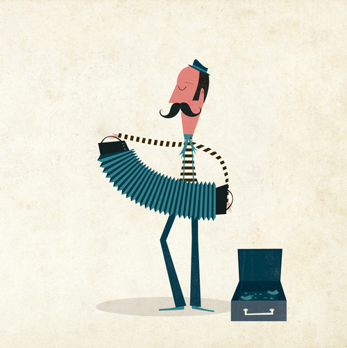
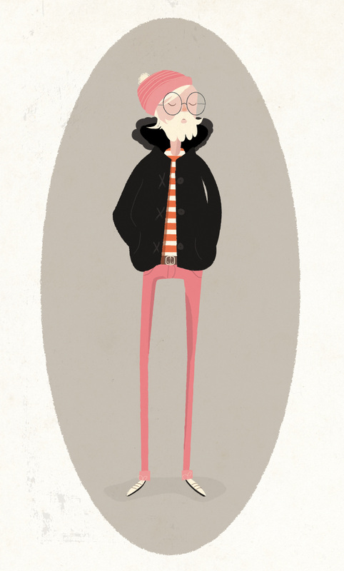
JORGE LEWARTA EXAMPLES
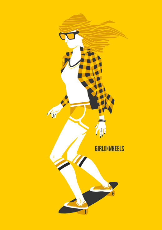
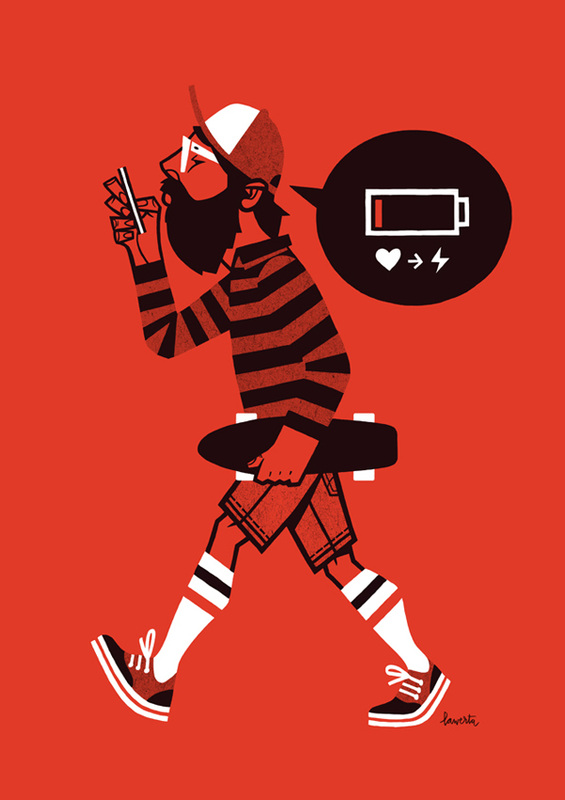
Key Elements in the Lewarta Style:
- Movement of some sort
- Some sort of communication(font or symbols can work)
- A definite sense of style in the clothing and hair
- A general personality or attitude to the humans he draws
- Simplistic Colour scheme(often monochromatic)
- A Simple idea or statement is communicated, often social or cultural
- exaggerated, simplistic, cartoon like style but not overly goofy
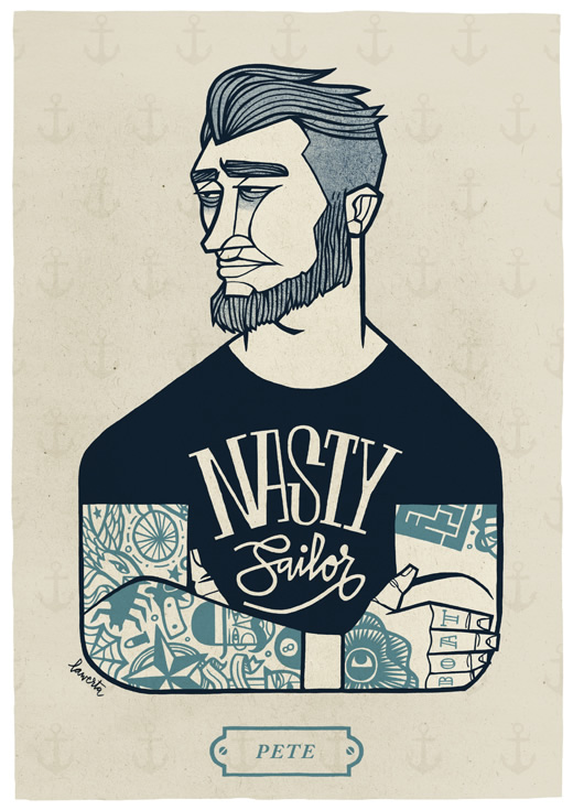
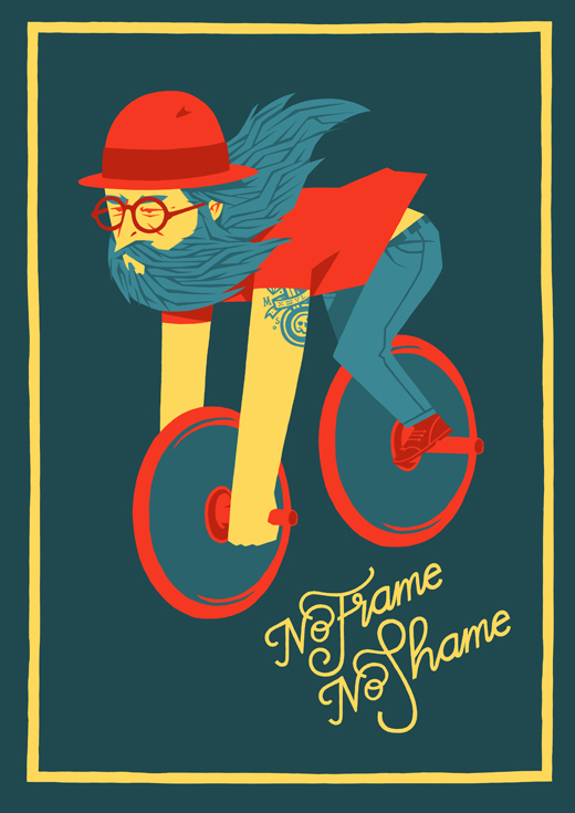
ANDREW BANNECKER EXAMPLES
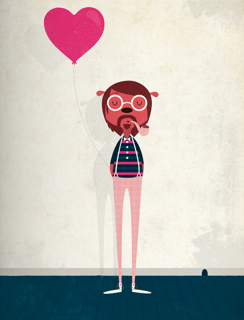
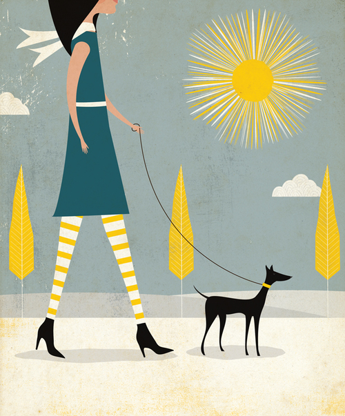
Key Elements in the Bannecker Style:
Very similar to the Lewarta approach with these additions:
Very similar to the Lewarta approach with these additions:
- More colours used in designs, generally
- An elongated form to the human(very long, stretched legs)
- More sinister, darker themes in some of his work
Key elements to include in how to illustrate this project:
- Start with sketches. Try to keep lines(paths) closed for easier illustrator tracing
- use the pen tool to draw more difficult shapes
- Use the wacom tablet to add small, hand drawn details
- Use the Pathfinder to combine or deconstruct shapes that can be drawn in illustrator
- Use textures where necessary
- Experiment with hand drawn and digital font, see what works
- Use several colour pallettes until you find the right one.
- These will be large so keep that in mind….have fun!
Typographic Olympics
Challenge: What if typography was a sport? Well as of today it is...You will compete in 3 typographic events, each event having something to do with designing with type.
Vocabulary: Serif, San Serif, Script, Specialty, Text, Leading, Kerning, Anchor Points
Tools: Pen, Selection, Direct Selection, Type, Character Box, Create Outlines, Skew, Rotate
Events:
- Using Arial font, choose a letter and redesign the letter by only adding, subtracting and bending anchor points. Your new letter should be dynamic, interesting, more exciting, and still be legible.
- Choose ANY font you wish. Think about the personality of that font, what would it looked like if it had a ‘face?’ Create a face out of this font that represents its personality. You may only use the letters of the font you choose, you may rotate, tilt, and scale the letters, however you may not stretch them.
- Choose a verb (an action word) and make that word do that action! (Ex. Make FAST look like it is moving fast!) Think about how you’d change the direction, skew, rotate, and move each letter as well as what FONT to choose and what colors.
Each event will begin with you sketching out 6-10 ideas in your sketchbook and refining 2-3 of them. Once you’ve done this you’ll show Mr. Francis your sketches and then you will be able to move onto the computer to begin the next phase of your design there.